Kurma Yoga
Brand Identity
As an avid yoga lover myself, I was excited about a recent opportunity of creating a brand identity for a new yoga studio.
The problem to solve with an identity in such a saturated market is creating something that stands out while still being recognizable as a yoga studio.
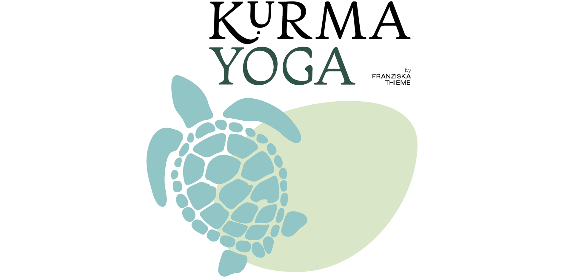
The brief and initial consultation established very quickly that the client wanted some kind of turtle integrated into the identity, as Kurma is the Sanskrit word for Turtle.
After thorough research and consideration, four initial concepts were presented to the client.
Concept 1
A soft branding with an emphasis on balance.
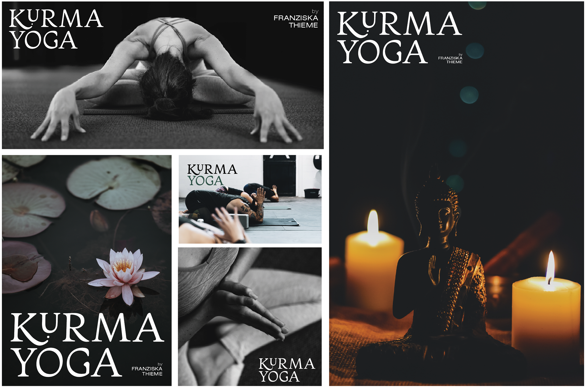
This approach combines a strong, unique, hand-drawn wordmark with an abstract turtle shape in slightly off-centred balance with a leaf or egg shape. This solution offers logo elements that can playfully and versatilely be used for marketing assets without losing a clear voice.
Concept 2

A playful branding with an emphasis on motion.

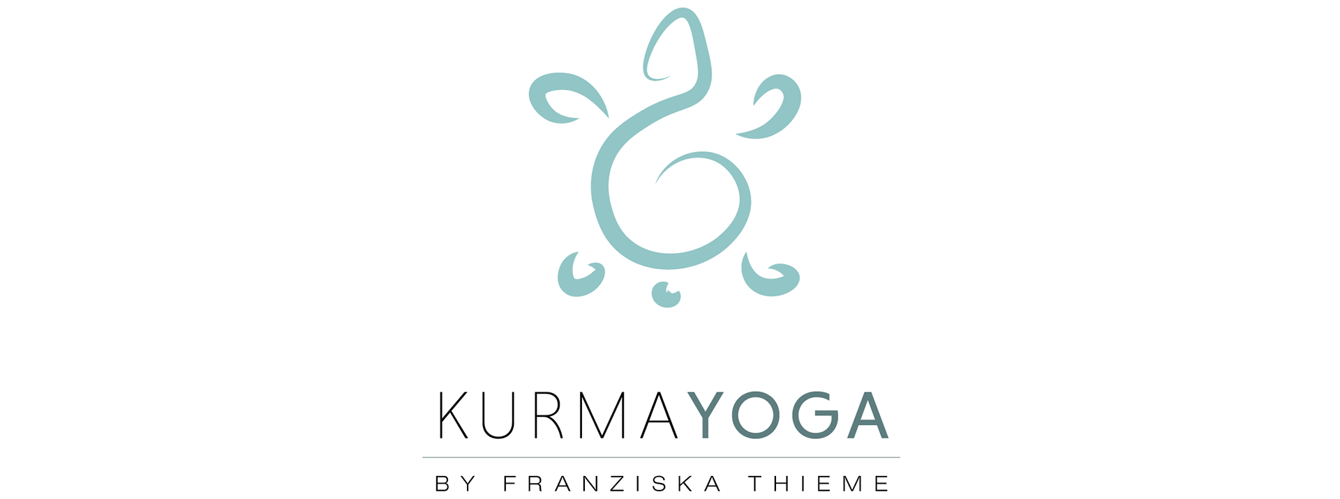
Concept 3

A minimal wordmark logo, emphasizing flow and balance.
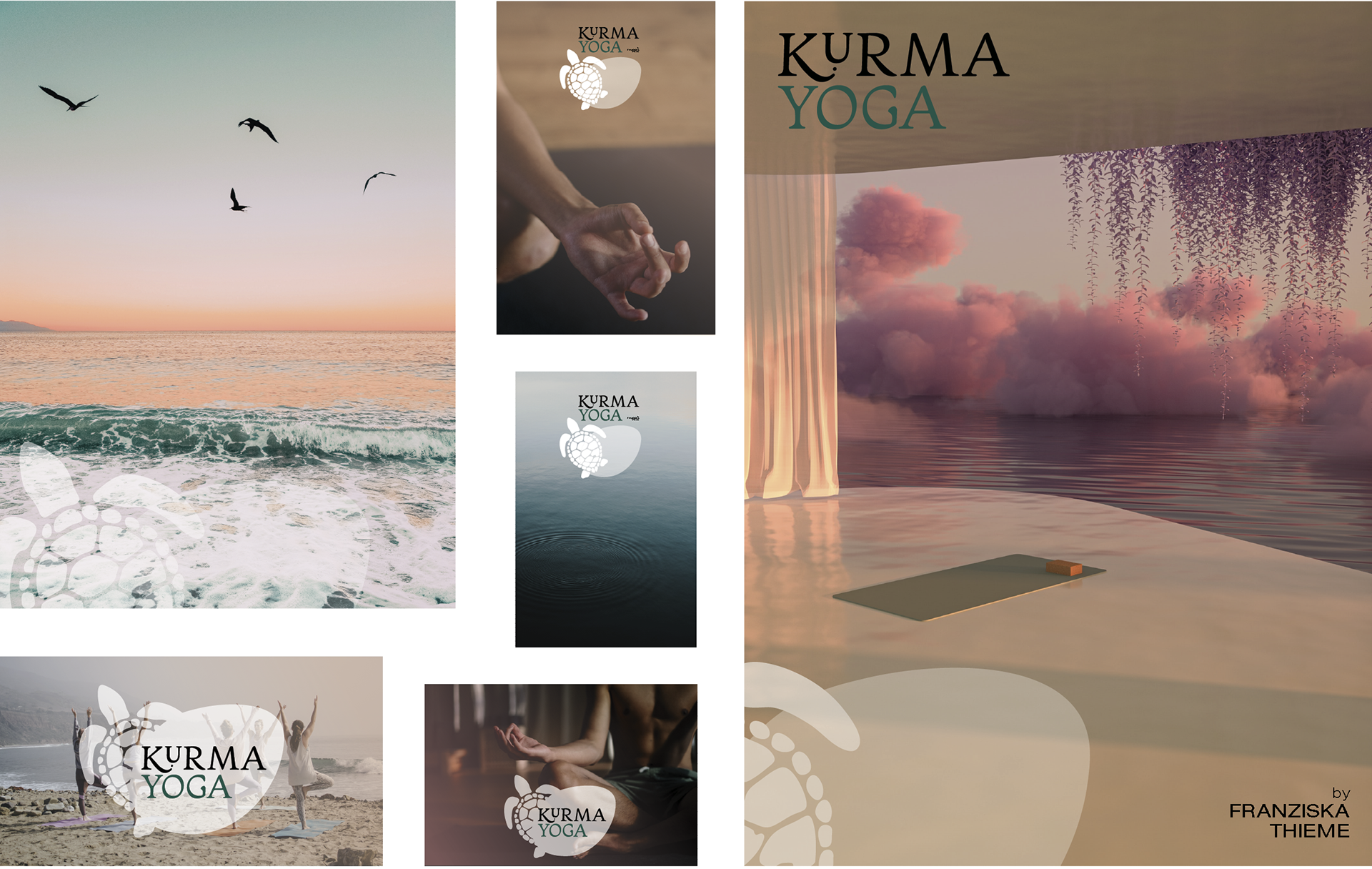
Concept 4 - selected concept
A gentle, airy branding emphasising flow and lightness.